
FreshBooks Onboarding Email Series Breakdown Pt. 1

FreshBooks makes accounting and invoices easier, but how does their free trial onboarding series add up? We’ll break it down, line by line.
Series Overview
The FreshBooks free trial spans the course of a month, which makes sense given its financial affiliation. In this post, I’ll be reviewing the first half of the onboarding email series. You can also check out Part 2 here.

Day 1.1: Authentication
Immediately after signing up for a FreshBooks free trial, an authentication email is sent out. All you have to do is press the big green button, which is a slightly shorter process than Salesforce.
An authentication process obviously has its own security benefits, but it will also filter out the very uninterested. This, in turn, will lead to higher open rates and roll to pay rates, since only the ones willing to take a few steps to access the service will receive the followup onboarding emails.

Subject Line: Please verify your email address for FreshBooks
Sender Name: FreshBooks
Send Time: Immediately after signup
Objective/Content: Have trial user confirm their account
CTA: Verify and Continue
Strengths:
All FreshBooks needs a user to do is click a button, so this email design is perfect. They also give the reason why they want you to take that action. As a user I most definitely want to keep my financial information safe, and am therefore happy to click on the button.
What to learn from it:
If you use an authentication process for security reasons, let users know! They’ll be grateful you take steps to protect them.
Day 1.2: Welcome

Subject Line: Welcome to FreshBooks!
Sender Name: FreshBooks
Send Time: Immediately after signup + authentication
Objective/Content: Introduce FreshBooks at a high level, along with its benefits
CTA: Start learning now, Sign up for a webinar, talk to Support, or visit the blog
Strengths:
Similarly to the Evernote Basic onboarding sequence, this first email from FreshBooks is a smorgasbord of options. Along with outlining some benefits of the service, there are four different links out for a user to choose from. Unlike Evernote, though, I think this smorgasbord is well laid out.
First, the high-level benefits are laid out in a bulleted and bolded form. Easy to catch on and read. The call to community is nice as well.
Then, each resource is clearly positioned with an accompanying icon. The headlines are straightforward, and the descriptions are brief.
Overall, the options are set up so that no critical information is missed, and each CTA gets a fair chance at being seen.
The bottom of the email also features a testimonial from a FreshBooks user. The smiling photo and glowing review are a prime example of using social proof in a way that supports, but doesn’t distract from, the content.
What to learn from it:
Put benefits front and center with a bolded, three-point list
If you’re going to link to mutiple pages and actions, make sure they are clearly differentiated. Unique icons for each plus descriptive headlines make your choose-your-own-adventure style email actually useful.
Social proof is easy to add to the bottom of the email as a form of insurance
Day 2: Introduce the Building Block
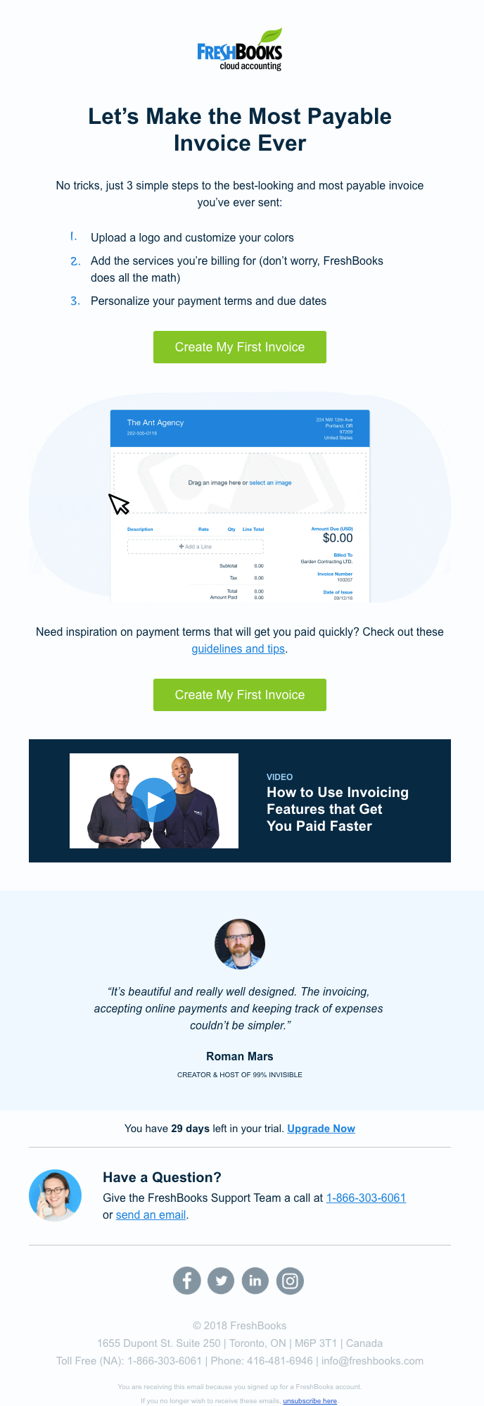
Subject Line: It’s Time to Make Your First Invoice
Sender Name: FreshBooks
Send Time: Day 2, 8:51 AM CST
Objective/Content: Outline how to create an invoice
CTA: Create My First Invoice
Strengths:
Unsurprisingly, the building block of the FreshBooks service is an invoice! It’s an element that will show up in a user’s daily or weekly workflow, and is the perfect baby step to engagement.
FreshBooks does an amazing job at introducing and familiarizing the building block. First, they lay out the process in 3 easy steps followed by a bold CTA button.
As if the step by step instructions weren’t clear enough, they also included an animation!

The animation follows the same three steps as the instructions, followed by some celebration confetti. It really does make the process seem simple. Immediately after the animation, there’s yet another irresistible green CTA button. In case a user still wasn’t sure how an invoice is created, another informational email is linked.
One of my favorite features in the FreshBooks email, though, is the free trial countdown. This email lets me know that I have 29 days left in my trial.
What to learn from it:
The building block should be an easy feature for new users to tackle, so simplifying it into around three steps should be easy
The simplicity and ease of the building block can be reinforced with an animation following the same procedure
Let users know how many days are left in their free trial. This serves as a reminder throughout the trial, as well as adds a sense of urgency to act on a paid account towards the end of the trial
Weaknesses:
This email has a handful of sections and visuals at play, but it’s at least clearly laid out. The CTA buttons are also consistent and show up more than once.
What to learn from it:
Include the same CTA a few times if there’s a lot included in an email
Day 4: Use Case

Subject Line: Want to Get Paid Lickety-Split?
Sender Name: Rachel Guloien (FreshBooks)
Send Time: Day 4, 8:51 AM CST
Objective/Content: Talk about two ways to make getting paid easier
CTA: Learn how, Enable online payments
Strengths:
So you’ve created an invoice…now you want it paid! FreshBooks sent a “use case” email on Day 4. This type of email combines different features and tools to show off a scenario. In this case, the scenario is getting paid faster.
This use case is presented as two benefits in bold letters — “say goodbye to late payments” and “get paid twice as fast with online payments.” By addressing a positive and negative scenario, FreshBooks is using a push and pull effect to inspire action. Their tools can help you avoid negative scenarios (late payments) while achieving positive outcomes (getting paid twice as fast).
FreshBooks also has a theme of support throughout their free trial sequence. Each email includes the option to email or call in to ask for help, as well as the picture and name of a real support agent.
What to learn from it:
Layout features and use cases as a user will encounter them in their workflow
Inspire users to take action with a push and pull method. Let them know how your product helps them avoid negative situations and achieve positive outcomes
If you have the Support resources available, let them be known! Even if you have a one-person support team, include their name and picture and welcome users to ask for help. Support tickets may seem like a bad sign on the surface, but someone willing to ask for help is more invested than someone who just writes your product off.